The graphical user interface in Infinite Painter uses standard Android controls, but in places the controls may have less-standard hidden features. And there are custom controller, like the XY curve graphs.
Buttons
Buttons in Infinite Painter may appear as icons or text labels.
All buttons accept the tap gesture to perform an action, but some of them also have secondary functions when you long-press on them.
A couple of other buttons accept more gestures too, like the virtual sliders on the Main toolbarMain toolbarThe main set of controls for the brushes. Almost always visible on the screen in the Studio workspace. Main toolbar lets you select and adjust the brush and pick the color for painting (and much more).Learn more.
Sliders
Sliders let you adjust the value of given parameter within its range.
Linear sliders
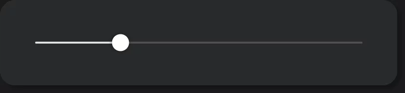
A linear slider enables you to select a value by sliding an indicator along a ‘track’. In general, the lowest value is at the left (or lower) end of the track line, the highest one at the right (or upper) end.
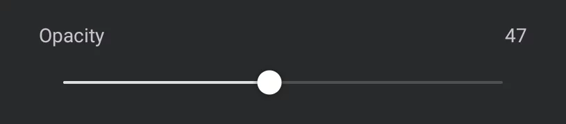
The name of the parameter controlled by this slider (here: “Opacity”).
The position of the round handle indicates the current value of the parameter in relation to its full range.
There is one special slider in the app that behaves differently. This is the dynamic font size slider in the Text tool.
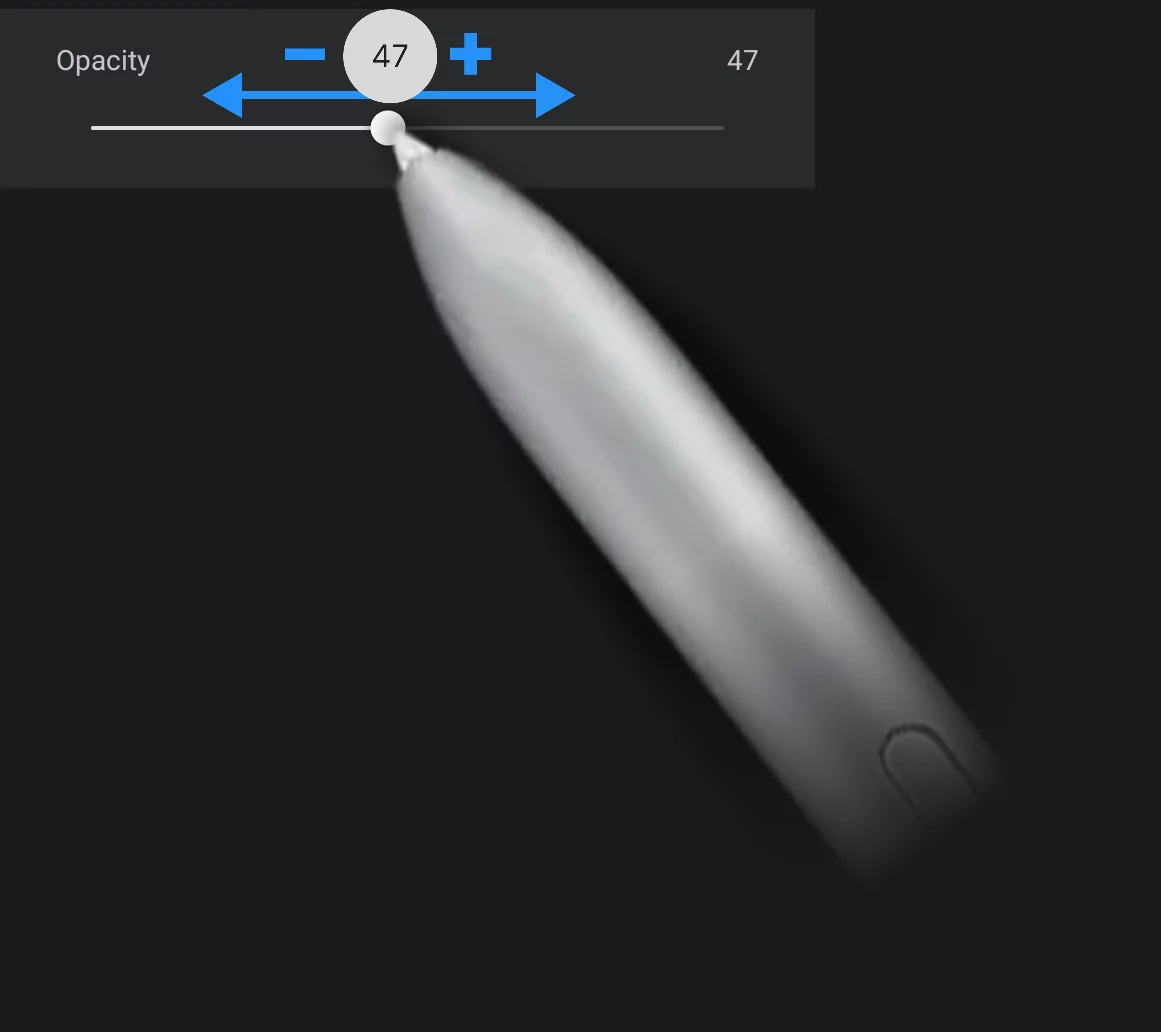
Drag the handle to adjust the value.
“Virtual minus button”
The left-hand end of the slider is an active area. Tap to decrease the value incrementally.
”Virtual plus button”
The right-hand end of the slider is an active area. Tap to increase the value incrementally.
Current numerical value of the parameter.
May show the units of measurement, like percent, degrees or pixels. If no unit is indicated, it is usually percent.
Adjusting the value
Drag the slider to set the desired value. Watch the current value in the popup bubble.
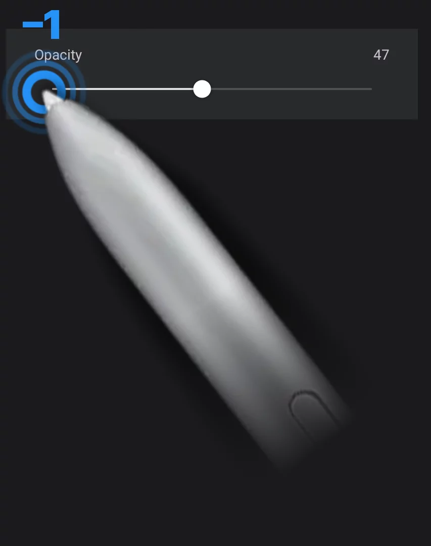
Precise adjustments
Tap on the left end of the sider to subtract one step from the value (to decrease the value).
Tap on the right end of the sider to add one step to the value (to increase the value).
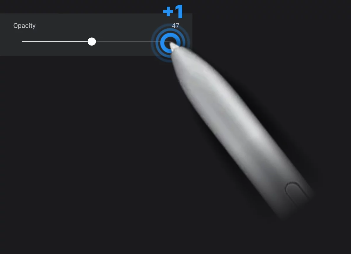
Note that the actual step of this adjustment depends on the units used in the parameter. For 0–100% ranges it will be 1% but for angular parameters (0–360º) it will be 3 or 4 degrees (1/100 of 360).
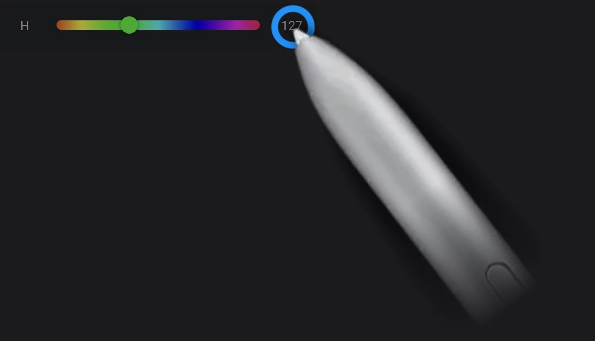
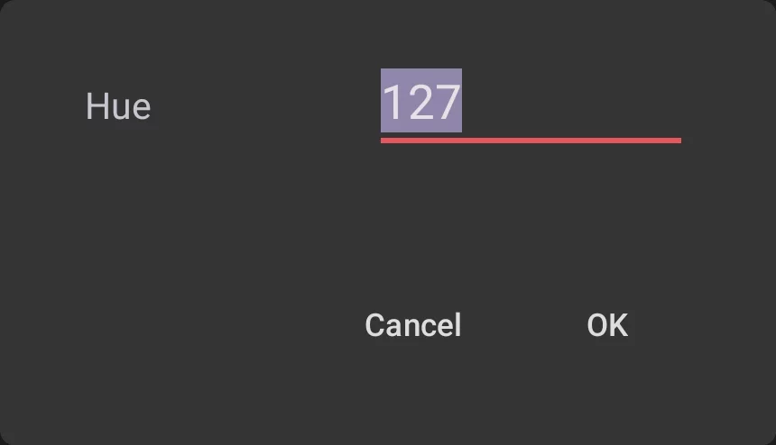
Setting the numerical value directly
In certain sliders (like the color sliders in the Color panelColor panelA panel to select colors.Learn more) you can tap on the numerical value at the right end of the slider to open the numerical text input box and enter the number from your onscreen keypad.
Circular sliders
More compact version of a linear slider. Used mainly in toolbars.

The highlighted part of the circumference indicates the current value in relation to the full range.
The number in the center, obviously, shows the numerical value.
Adjust the value by dragging left-right (or down-up) from the center of the circle.
Watch the current value in the popup bubble.
In some of the circular sliders you can tap on the control to display a popup with a regular, linear slider for more precise control:
This popup slider works exactly like any other linear slider in the application.
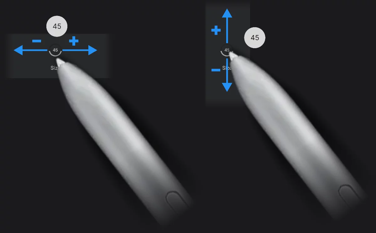
Virtual sliders
Some of the sliders in Infinite Painter are hidden. These are, first of all, the brush Size and Opacity sliders in the main toolbar.
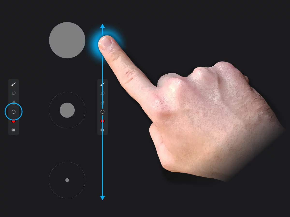
These virtual sliders work similarly to the circular sliders, only having a different visual form.
Learn more in:
Quick brush opacity adjustments
Selector lists
A basic menu with a list of available options. Tap to open the list, tap an item to select it.
Curve graphs
See a detailed description in Brush Editor — curve graph controls.
Toggles
Toggles are switches that have two states: active (ON) and inactive (OFF).
Inactive (top) and active (bottom) toggles:
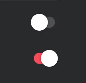
Toggle (change) the state of the switch with a TapTapThe simplest gesture on the touch screen: a short touch on the surface. You can tap with your finger or with a stylus.Learn more gesture.
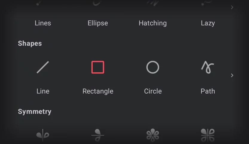
Toggle icons
Besides the standard Android toggle switches (shown above), a number of icon-buttons in Infinite Painter behave as toggles.
Here, the Rectangle shape tool icon is highlighted red, indicating that the tool is active. Tapping on the highlighted icon will toggle it (deactivate the tool).
If you dock such a toggle icon on the Custom toolbar, it will also behave as the toggle (so the icon would serve as an indicator of the state of the function).
Mini-toolbars
For certain tools, a mini-toolbar is being displayed in the upper-right part of the screen when the tool is active. The mini-toolbar may consist of only one button, but may have more buttons for other tools. In general, the mini-toolbars are displayed for tools that do not have dedicated custom toolbars.
One-button mini-toolbar (for vertical symmetry tool)

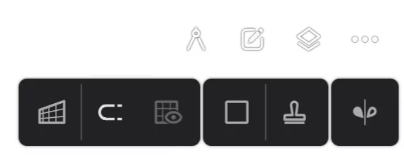
Mini-toolbar with multiple buttons
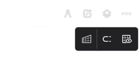
Here the mini-toolbar for Perspective grid, containing three buttons: the main button and two toggles for grid snapping and grid visibility.
If several tools are active at the same time, their mini-toolbars will be stacked:
(here three mini-toolbars are displayed in a row: for the 1p Perspective grid, the Rectangle shape and Vertical symmetry).
Tapping on the main icon of the mini-toolbar closes the tool. Functions of the secondary buttons depends on the selected tool.