Text frame controls
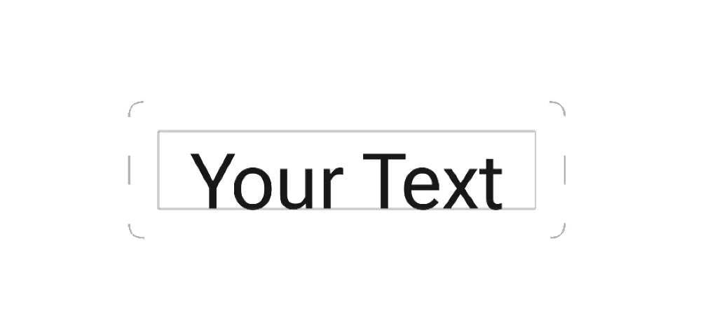
The text frame is a bounding box containing all the text you’ve entered in the text editor.
Corner handles allow you to resize the text object as a whole.
Side handles adjust the width of the text frame (not the text itself). The height of the text frame adjusts automatically.
In Infinite Painter the text frame always contains the entire text, however parts of it may be invisible if placed outside the canvas.
You can move the text frame around the canvas by dragging it with your finger or stylus.
When you are moving or resizing the text frame, automatic alignment guidelines are displayed for easier positioning.
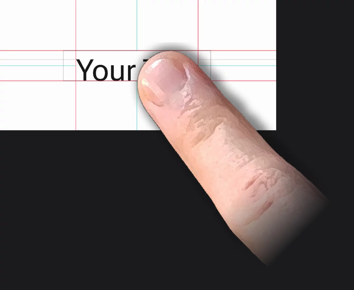
Green guidelines (centerlines)
indicate the center of the text block vertically and horizontally.
Red guidelines
indicate the edges of the text block (not the frame).
Grey lines indicate the height of each line in a multi-line text block.
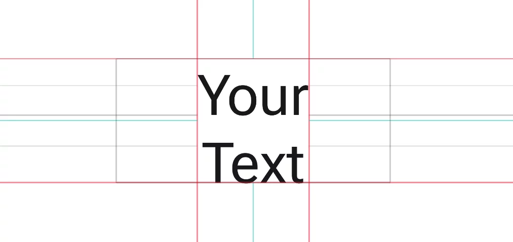
When you drag the text object near to the center of the page, blue lines will appear indicating the axes of the canvas. The centerlines of the text frame will snap to these axes.
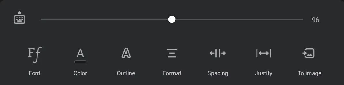
The Text toolbar
![]()
Keyboard button
Opens the on-screen keyboard for entering the text.
(This equals the double-tap gesture on the screen)
![]()
Font size slider
Note that this slider works dynamically: the handle always returns to the middle position. This allows you to quickly change the text size in very broad range while in the same time giving precise control over the value.
The numerical value on the right shows the text size in pixels.
![]()
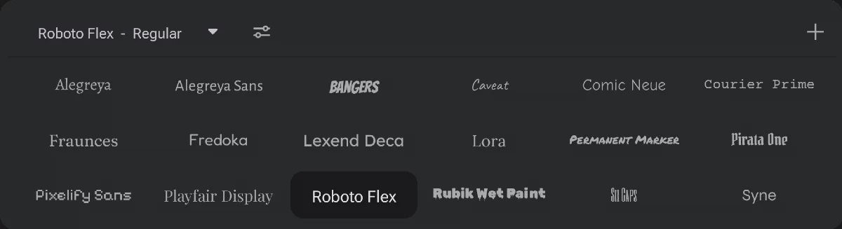
Fonts
Opens the font selector.
The list shows available (installed) fonts and font families. You can add custom fonts to this list.
For font families, the available font weights and variants can be selected from the popup list at the top of the font selector.
For flexible fonts, additional controls can be found under the “settings” icon, next to the font weight selector.
Learn more in Font selector section below.
![]()
Color
Sets the fill color for the text.
If the ‘Outline only’ option is activated the fill color is used as the outline color.
![]()
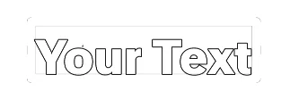
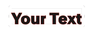
Outline
Lets you add an outline to the characters.
Learn more below.
![]()
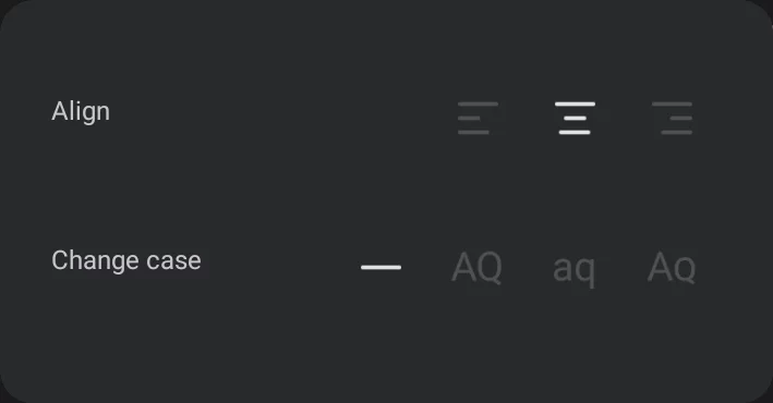
Format
Text alignment and case settings.
Please note that Infinite Painter has only three alignment options: left, center, right, but there are multiple ways to justify a text block (align both sides of the text block); more in Justify.
Learn more below.
![]()
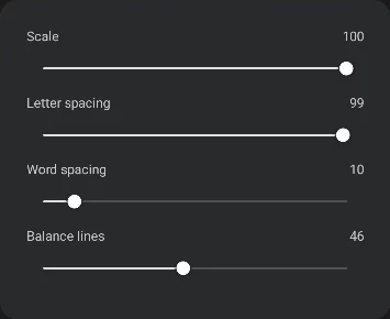
Spacing
Controls for letter, word and line spacing.
Learn more below.
![]()
Justify
Opens a panel with controls for text justification.
Learn more below.
![]()
To Image
(= “rasterize the text”)
Converts the text object to a regular bitmap layer. This allows you to edit the text as a part of your artwork with all the regular tools but the text can no longer be edited as text.
Conversion to bitmap layer is irreversible. You can undo this action but you cannot revert to editable text later.
Text editing controls
![]()
Current font name
Opens the Font Variant selector
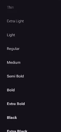
Pick your preferred font variant (weight) from the selected family.
Note that this selector lists the fonts variants (”weights”) that are actually available in given font family. For some font families the list may contain only one font while for others dozens of variants.
Variable font controls
(shows up only if the current font is one of the Variable fonts)
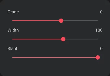
These controls depend on the design of given variable font.
Each slider controls one axis of the variable font. Note that these axes may be different for each variable font. Learn more about variable fonts in Variable Fonts – Fonts Knowledge - Google Fonts
Add custom fonts
Learn more in Custom fonts.
The font list will include any custom font you install. Custom fonts are not visually distinguished from the built-in fonts.
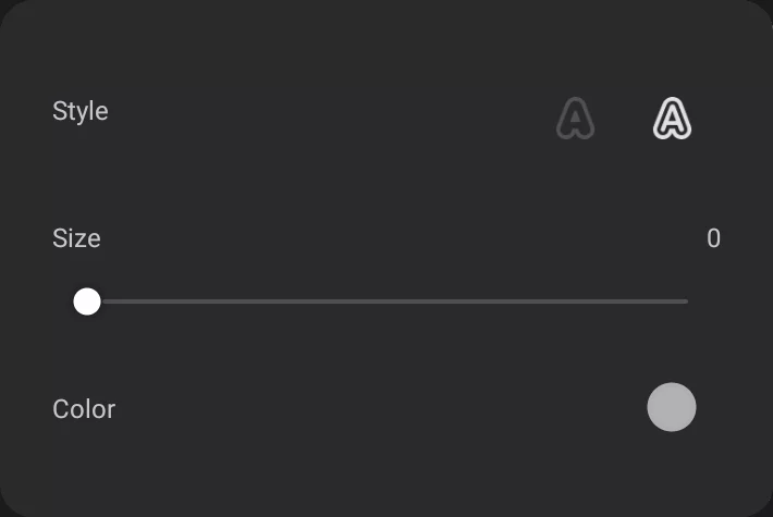
Outline only (uses the fill color)
Outline + fill (fill color and outline color set separately)
Size slider
– adjusts the width of the outline. Zero value turns the outline off.
Numerical value in pixels.
Outline color
Tap to open standard color panel to pick a color for the outline.
![]()
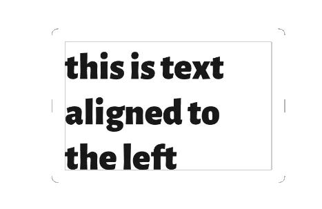
Align left (’flush left’)
![]()
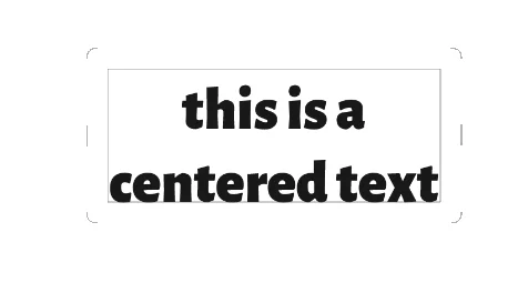
Align center (’centered’)
![]()
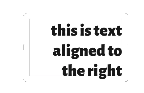
Align right (’flush-right’)
Note that there is no direct “Justified” text alignment option here. Use the Justify panel to align both sides of the text. See Text justification.
Capitalization (letter case)
![]()
Normal case
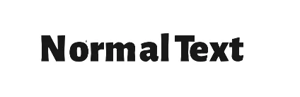
Text is rendered exactly as typed in. Note that there are fonts that have no lowercase characters, so all the text may appear as “all caps”.
![]()
‘All caps’

All characters in uppercase.
![]()
All lowercase

All characters in lowercase.
![]()
‘Small caps’

All characters in uppercase but lowercase characters smaller than the uppercase variants.
‘Small caps’ style must be supported by the font, otherwise the text will appear as Normal.
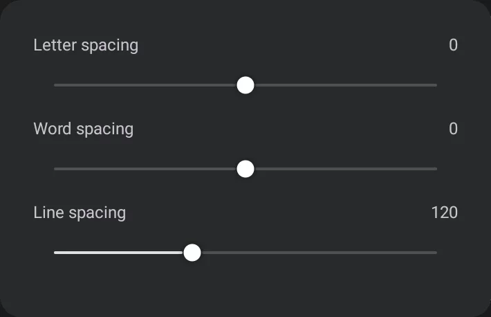
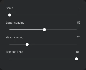
Letter spacing
Spacing between letters in text. Zero means standard spacing, as the font has been designed. Negative values means the characters closer to each other, positive farther.
Word spacing
Spacing between words (= the width of the space character).
Note that the letter and word spacing may be affected by other parameters, especially by the [justification controls]. Text justification.
Line spacing
Vertical distance between the lines of text. The value is expressed in percent of the font size.
Standard line spacing in typography is usually 100–120% of the text size. Values below 100% may cause the lines of the text overlap.
This however may be perfectly acceptable in case of decorative lettering:
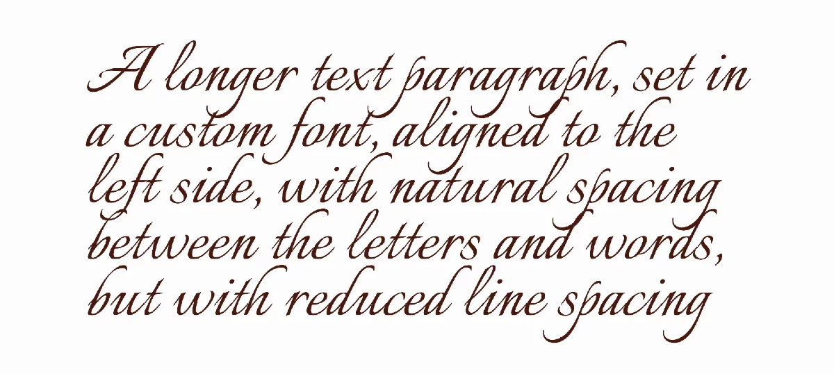
(Italianno Regular 400 font from Google Fonts; line spacing 70%).
![]()
Text justification
Justification in typography means setting a paragraph of text so that both the left and right edges of the text block appear vertical. This may be achieved in a couple of methods:
Traditional justification method (spacing)
The most common method to justify text block is by adjusting the letter and word spacing in each line so the line is stretched exactly between the left and right side of the text block.
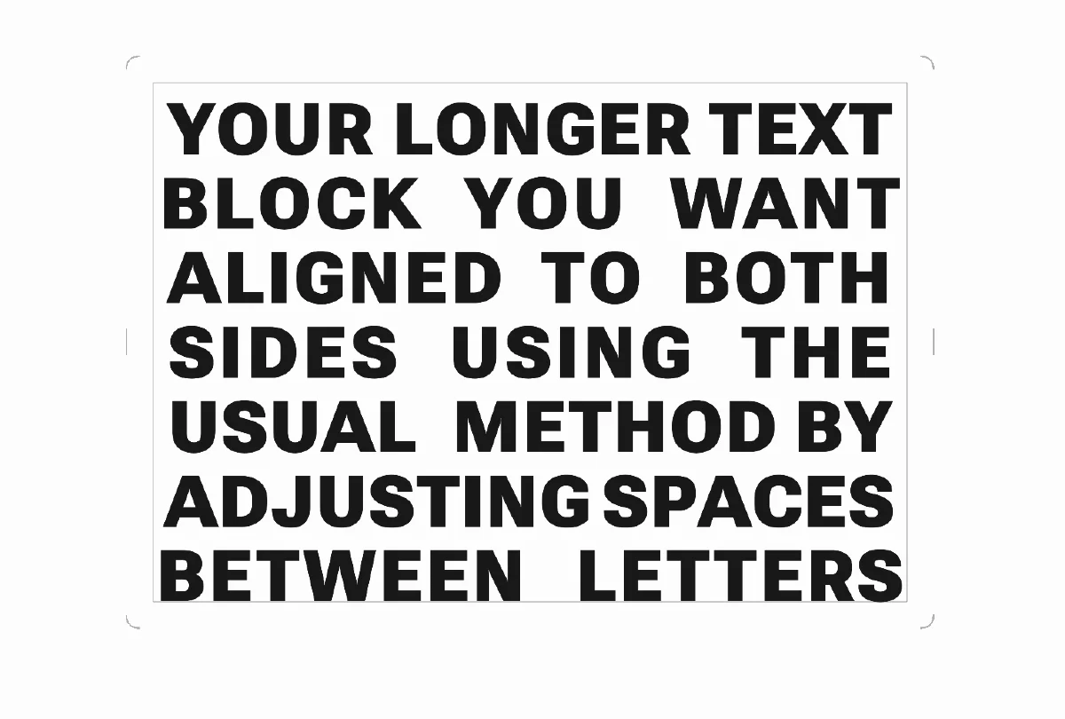
To justify a block of text in this “traditional” way, use the Letter spacing and Word spacing sliders.
Note that it may be impossible to correctly justify the text block this way when the text column is too narrow for given font size. The typographic ‘golden rule’ is to keep the line length above 25 characters.
For narrower columns and very short text consider using the ‘scale justification’ method.
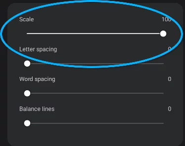
Scale-justification method
While the traditional way to justify a text block is by adjusting the spacing between characters and words in each line, in Painter you can find another tool: scale-justify. This option adjusts the size (height) of each line in order to align the sides of the text block.
This tyle of visual balancing of the lines is widely used in book cover design.
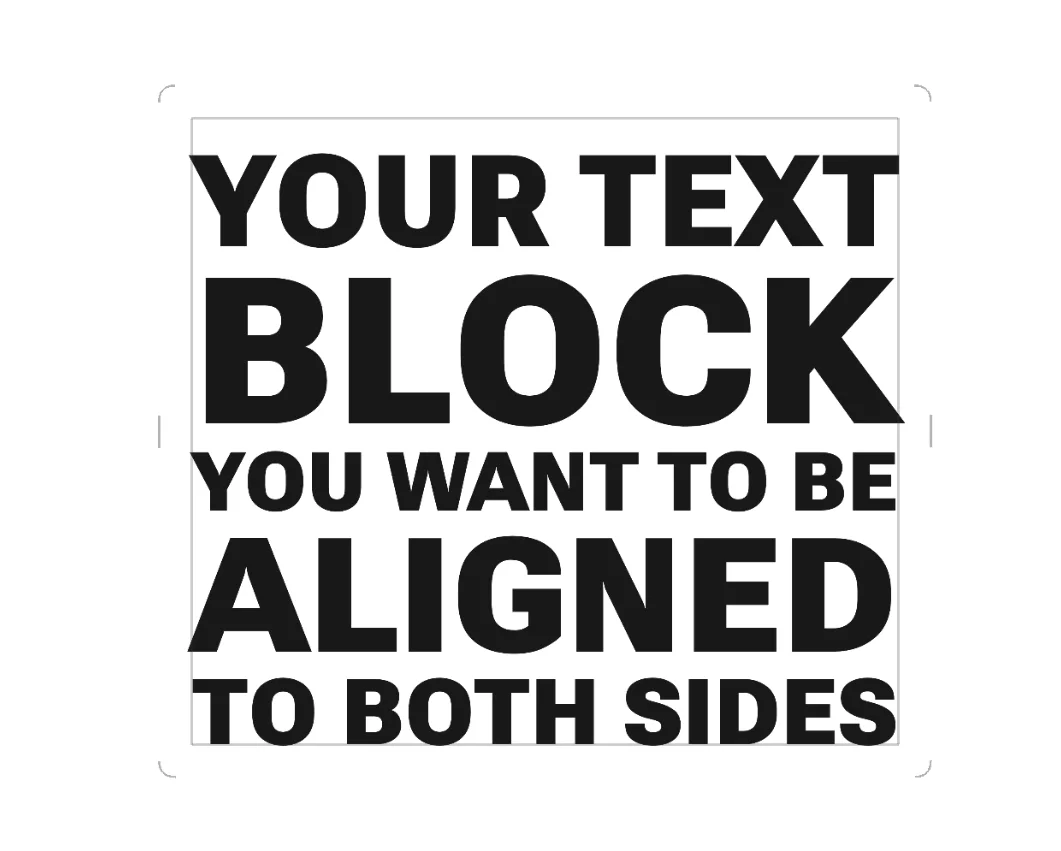
Use this option along with the Balance lines slider and with manually entered line breaks (”enter” characters).
Infinite Painter 7.2 does not support hyphenation (breaking longer words at the end of the line). This may limit the text tool in setting longer blocks of justified text. On the other hand, this app is intended for digital painting, not for page design. Use a third-party word processor if you need this feature.
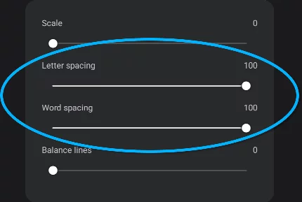
Balance lines
This slider adjust the visual balance between lines by smartly adding space between letters and words.
With Balance lines off
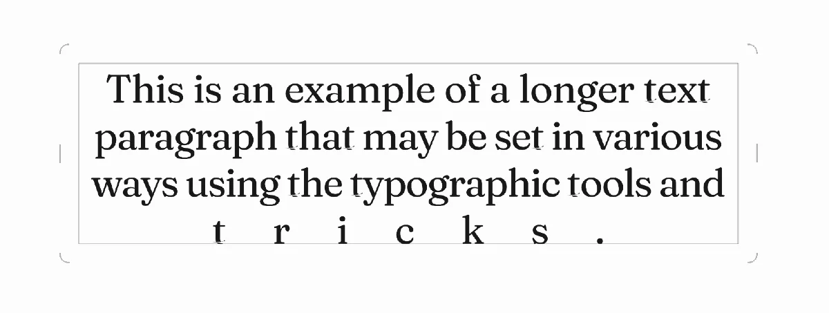
Here the text block is obviously poorly set. The last line spacing is unacceptable.
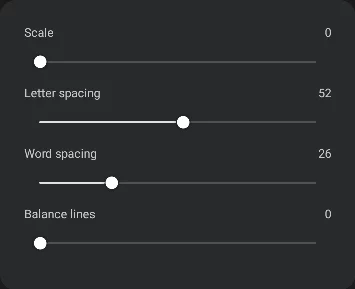
With Balance lines 100%
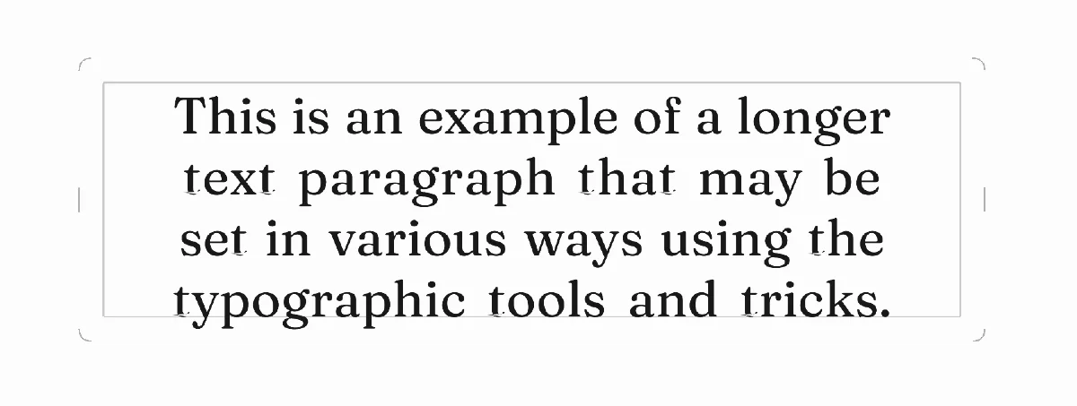
Here the Balance lines option helped distribute the spacing more evenly. The effect is much better appearance of the text block. Note that the Letter and Word spacing values remained unchanged.
Using text with other tools
By themselves, the text layers may have limited visual properties: fill color, outline and layer opacity. But you can use all other tools in Painter to add visual richness to your typographical compositions.
An example of text decoration
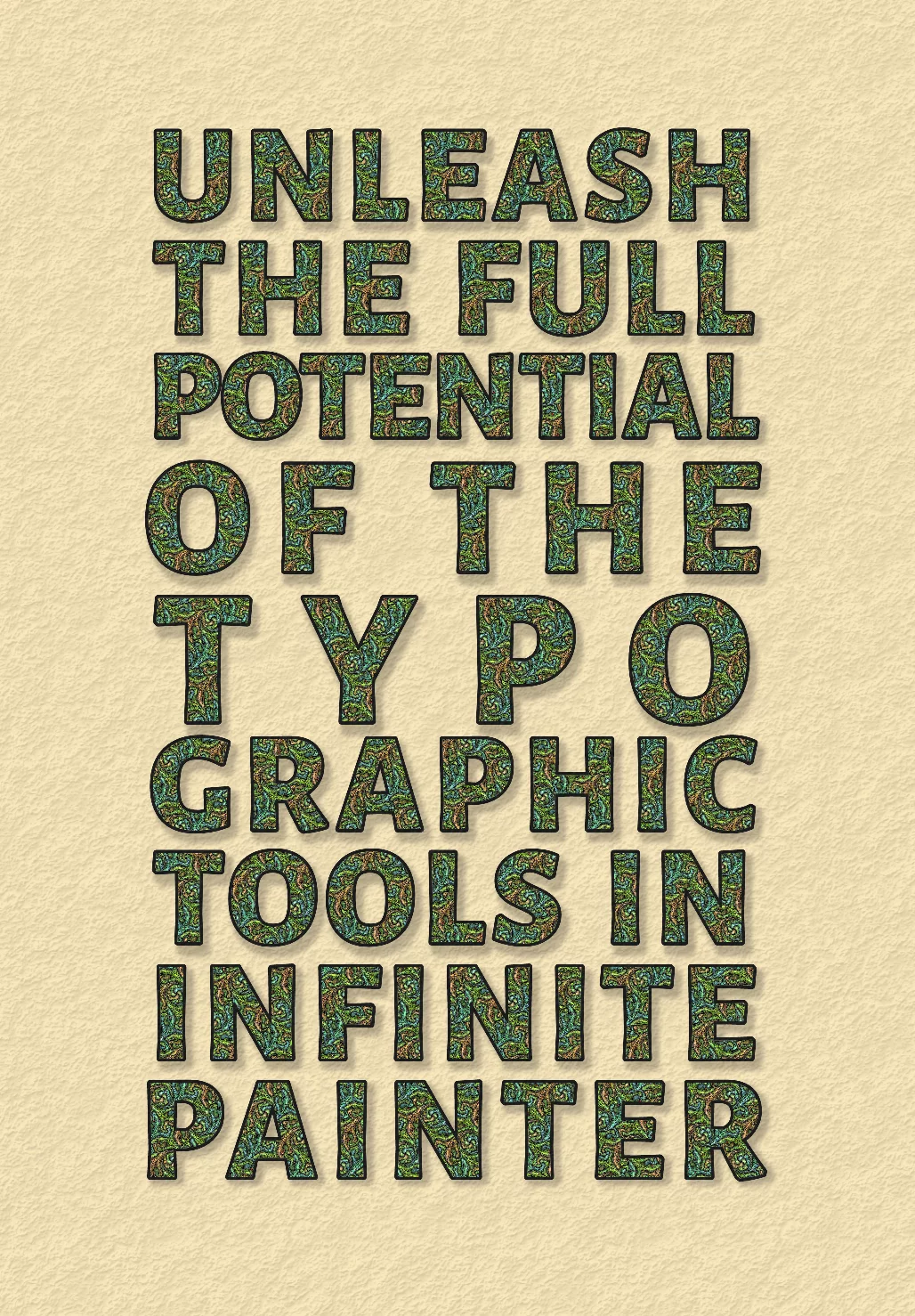
Here the text layer has been used as a clipping mask for a fill layer, a copy of the same text added on top for a crisp outline and another copy (rasterized) below as a drop shadow.
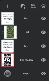
The text has been set in Alegreya Sans - Extra Bold font, All caps style and with mixed justification options: